[Call for papers] Advances in Social Network Analysis – Spatio-Temporal and Semantic Methods

I am co-editing a Special Issue titled “Advances in Social Network Analysis – Spatio-Temporal and Semantic Methods” in the ISPRS International Journal of Geo-Information (IJGI) with Hartwig Hochmair (University of Florida) and Bernd Resch (University of Salzburg / Harvard University).

We’re expecting original contributions that address interesting questions using data from social media, location-based service (LBS) and volunteered geographic information (VGI) platforms. More info and submission form can be found on the IJGI website.

Academic Track @ State of the Map 2019

The global State of the Map 2019 conference this year will again feature a full day of academic talks. On behalf of the Scientific Committee, I am delighted to invite you to submit your abstract.

We are looking for scientifically rigorous contributions between 500 and 800 words. Please consult the Call for Academic Abstracts for full details. Submission deadline is May 10. Questions should be sent to academic-sotm [at] openstreetmap [dot] org.

State of the Map 2019
Where: Heidelberg, Germany
When: September 21-23, 2019

Scientific Committee:

Dr. Marco Minghini – EC Joint Research Centre, Ispra, Italy
Dr. A. Yair Grinberger – Heidelberg University, Germany
Dr. Peter Mooney – Maynooth University, Ireland
Dr. Levente Juhász – Florida International University, USA
Dr. Godwin Yeboah – University of Warwick, UK

VGI-HATcH: Workshop at AGILE 2019 in Limassol, Cyprus (June 17, 2019)

We are organizing a workshop at the AGILE 2019 conference which will be held this June in Limassol, Cyprus. The workshop is titled as “VGI HATcH – Using Volunteered Geographic Information for Help and Assistance in Transport and Humanitarian operations”. Consider submitting your contributions. Looking forward to seeing you there!

This full-day workshop provides an opportunity for interested researchers and practitioners to share ideas and findings on innovative methods for the spatio-temporal analysis of crowd-sourced data, to demonstrate real-world applications using data from different crowd-sourcing platforms, and to discuss technical questions and innovations on data access and data fusion. The first portion of the workshop consists of short paper presentations under the general workshop theme. The second portion focuses on showcasing practical applications of VGI and social media. This includes but is not limited to: demonstrations of successful examples of using VGI/social media for humanitarian operations; use of VGI/social media for decision support in government on health societal or transport issues; use of VGI/social media or Open Data for improvement of base maps; short tutorials or demonstration of VGI/social media data analysis methods and data extraction from various online resources. Accepted papers and abstracts will be uploaded to the workshop Website. The workshop editors plan to host a special issue in the ISPRS International Journal of Geo-Information journal as a follow up to the workshop. Workshop presenters will be invited to submit full papers.

We are looking for short paper or demo submissions in this domain. More info can be found on the workshop website at http://www.cs.nuim.ie/~pmooney/vgi-hatch2019/. Any questions, feel free to ask.

Workshop organizers:

Just another Miami-Dade OSM Import…

Yes, another data import because they are not evil! Check these resources to learn more about how we added most buildings and address points to the map in Miami-Dade County.

Wiki page

Import tool on GitHub

Tasking manager project

Join us on the OSMUS Slack if you want to talk maps! Self invite at https://osmus-slack.herokuapp.com, then join the #florida channel at osmus.slack.com.

Talk @ State of the Map US

Last October I went to Colorado. The purpose of this trip wasn’t hiking (okay, I went hiking as well) but to attend the State of the Map US conference held at the University of Colorado Boulder. My talk was about how we’re trying to build a geospatial community in South Florida and I presented some results of our OSM building import. Recordings came online recently so here’s a video of my talk. Enjoy.

P.S. Hiking was also great. You’ve got to visit Colorado during fall! It’s amazing.

Understanding the cross K-function [interactive visualization]

!!!UPDATE!!!
Since this post is still getting a lot of views, some of you might be interested in the
outcomes of my experiments with the cross K-function. I used the function in 2 recent
papers. Links to the articles are found on the Publications page.

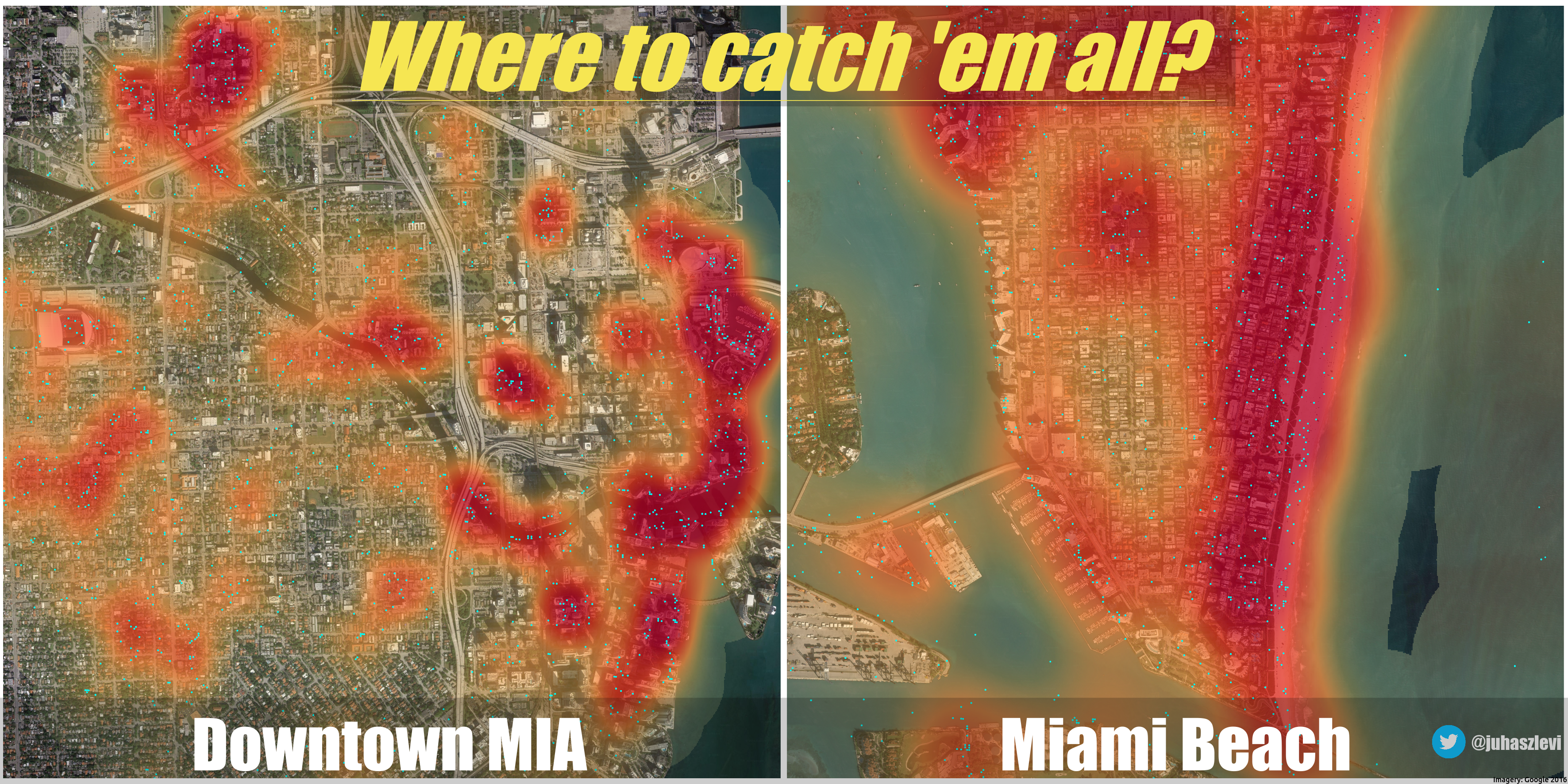
Juhász, L. and Hochmair, H. H. (2017). Where to catch ‘em all? – a geographic analysis
of Pokémon Go locations. Geo-spatial Information Science. 20 (3): pp. 241-251

Hochmair, H.H., Juhász, L., and Cvetojevic, S. (2018). Data Quality of Points of
Interest in Selected Mapping and Social Media Platforms. Kiefer P., Huang H., Van de
Weghe N., Raubal M. (Eds.) Progress in Location Based Services 2018. LBS 2018. 
Lecture Notes in Geoinformation and Cartography (pp. 293-313) Berlin: Springer.

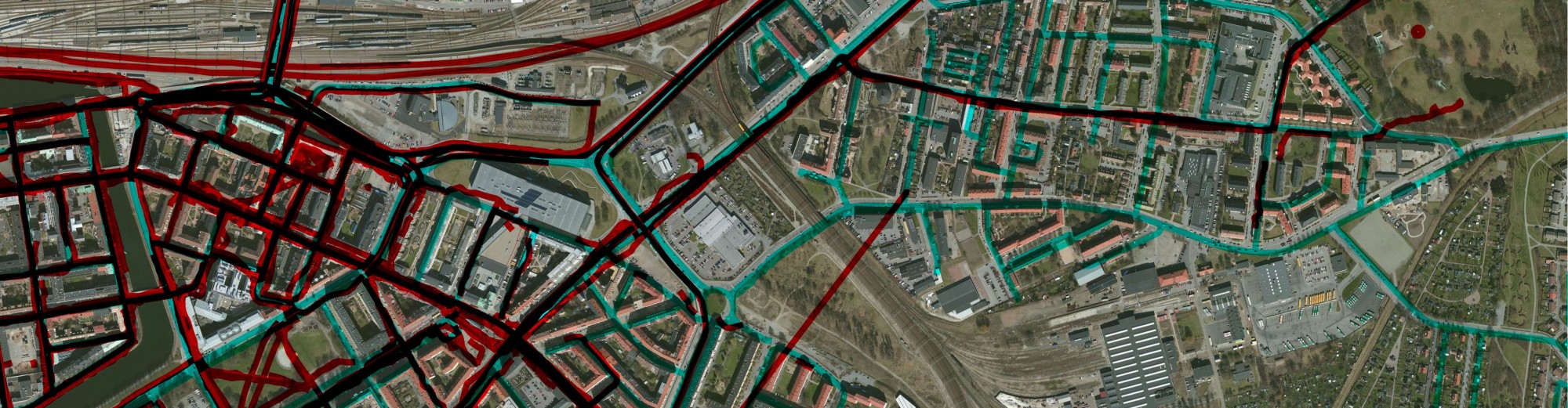
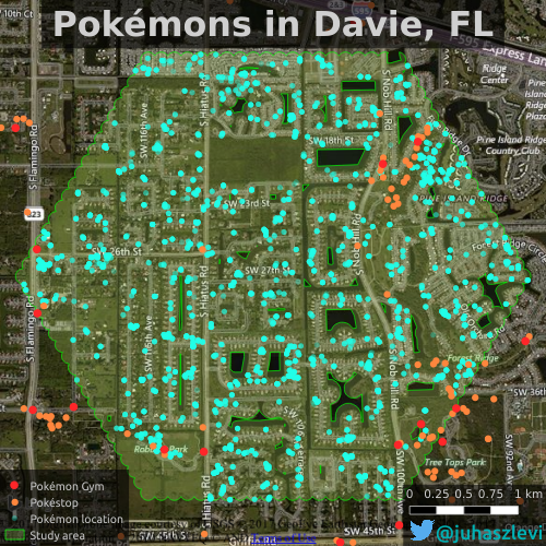
One of the research papers I’ve submitted recently (yes, about Pokémons!) dealt with spatial point pattern analysis. Visually it seemed that two of my point sets prefer to cluster around each other, in other words I suspected that Pokéstops have a preference of being close to Pokémon Gyms. Check the map below to see what I mean. Pokémon locations (cyan dots) are all over the place as opposed to Pokéstops (orange) that almost exclusively appear to be in the proximity of gyms (red).
davie_poke

To confirm what’s obvious from the map, I used the bivariate version or Ripley’s K-function (a.k.a. the cross-K function) that can help us characterize two point patterns. As it turns out, it’s not as easy to interpret as I though it would be (at least with real world data) and I was trying to get my head around it for quite some time. As a result, I came up with a simple interactive visualization of this function to illustrate what it really means. If you’re anything like me and try to understand your stats instead of just reporting the results, you might want to read on more for some musings about the cross K-function.

Continue reading

Sneak peek

If you like playing with data, chances are you’ve come across D3.js, Data-Driven Documents. Here are two of the first visualizations I made with it. I’m going to write up a more detailed blog post about it later. In the meantime – without commentary -just enjoy.

!! UPDATE: check out my post about Mapillary’s Rhythm !!

And the second one (without attempting to scale it to the screen):


More videos on cross-mapping

Oops, I forgot to share my “new” videos I made this June. Better later then never, I guess. Anyways, it’s part of my research that aims to understand how regular people on the Internet use different mapping platforms. Well, not just mapping platforms but basically any platforms that you can think of including Instagram, Foursquare, Twitter, Facebook an many more. We know that many of you use multiple services during your daily routines. Previous research focused on each of these data sources separately so we have a lot of knowledge on them (not playing the Big Brother here, I’m talking about an aggregated level). However, we do not yet know how the same individual uses these services simultaneously. Do activity spaces overlap? Is there a single main service or do people use different services with the same intensity? Does the introduction of a new service affect previous usage patterns? Can the user base from a platform drained by another? How do these processes work in time and space? Well, and I have many more questions. Probably way more questions than I can realistically answer, especially when don’t just talk about simple social media photos but really high quality mapping activities (as in editing OpenStreetMap and taking Mapillary street level photos specifically for mapping).

Nevertheless, I started working on this kind of research and made some early visualizations. Below are two videos showing how OpenStreetMap users pull images from Mapillary and edit the map based on other people’s contributions. How crazy is that? You grab one source of user generated content to improve another? Who would have thought about that 5 years ago?

The first map shows to what extent an OSM mapper loaded Mapillary photos to his editor (cyan rectangles) and showcases (with labels) whenever an editing activity based on those photos could have been identified. It means that people really check photos over an extensive area just to see if they can find some new details to add to the map. I think it’s impressive.

Read on to check another video!
Continue reading

Where to catch ’em all?

I should really stop playing around with side projects and should get back to my research. But look at this! I recorded a few hundred thousand Pokemon encounters over the past few days. You know, just for fun, because that’s what grown ups do. I marked all Pokemon locations in Downtown Miami and Miami Beach with cyan dots and created a heatmap on top of them to see where you should wonder if you want to catch as many as you can.

Pokemon locations and density in Miami

Click for a high-res version.

To be honest, I don’t play Pokemon Go. Was never into this thing. But I do like maps and data. And this is really cool data. So, I’m thinking. Maybe. What if I made it my research… what if I could come up with something really interesting? Oh, well. Instead of trying to justify myself, I guess I’m just gonna catch ’em all along with some awesome spatial analysis.