I created a dedicated page for my research at https://research.jlevente.com. I am looking for contributors who would help me out with some data. Check it out if you’re interested and sign up if you want to help. All info can be found on the website.
If you like playing with data, chances are you’ve come across D3.js, Data-Driven Documents. Here are two of the first visualizations I made with it. I’m going to write up a more detailed blog post about it later. In the meantime – without commentary -just enjoy.
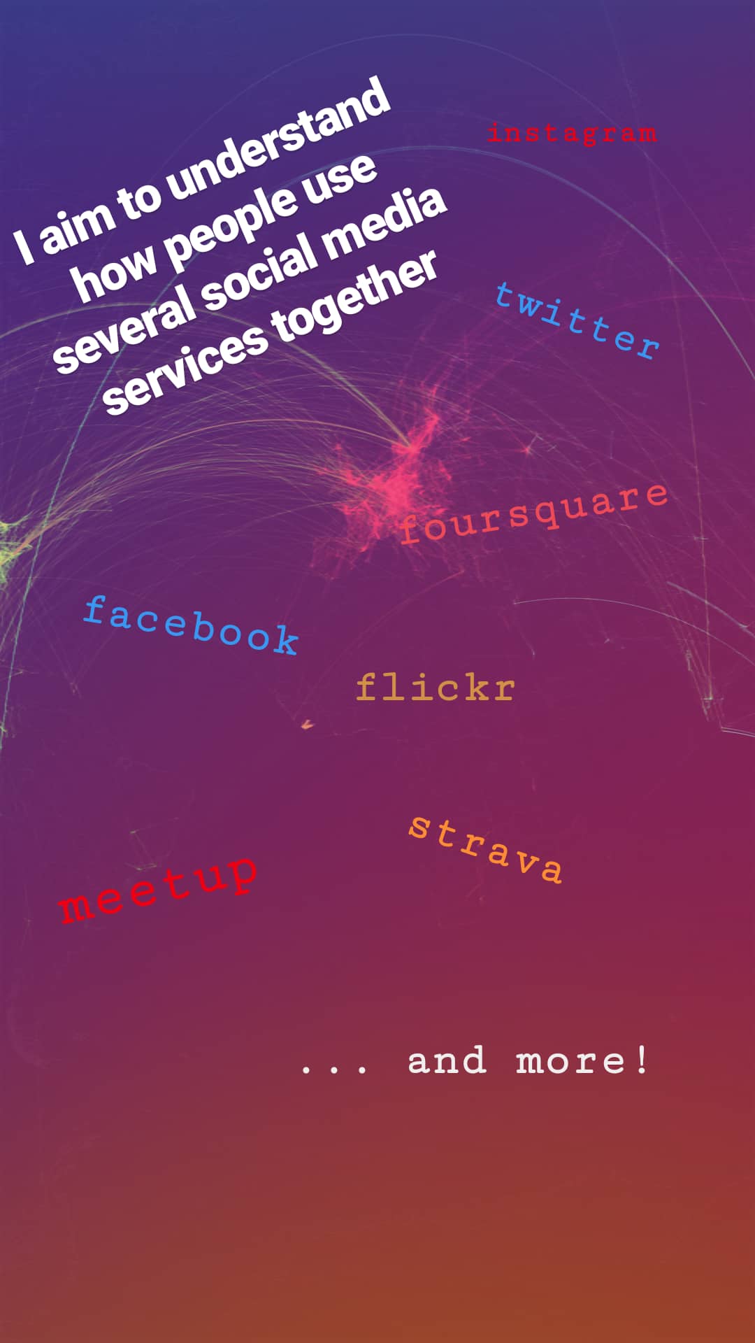
Oops, I forgot to share my “new” videos I made this June. Better later then never, I guess. Anyways, it’s part of my research that aims to understand how regular people on the Internet use different mapping platforms. Well, not just mapping platforms but basically any platforms that you can think of including Instagram, Foursquare, Twitter, Facebook an many more. We know that many of you use multiple services during your daily routines. Previous research focused on each of these data sources separately so we have a lot of knowledge on them (not playing the Big Brother here, I’m talking about an aggregated level). However, we do not yet know how the same individual uses these services simultaneously. Do activity spaces overlap? Is there a single main service or do people use different services with the same intensity? Does the introduction of a new service affect previous usage patterns? Can the user base from a platform drained by another? How do these processes work in time and space? Well, and I have many more questions. Probably way more questions than I can realistically answer, especially when don’t just talk about simple social media photos but really high quality mapping activities (as in editing OpenStreetMap and taking Mapillary street level photos specifically for mapping).
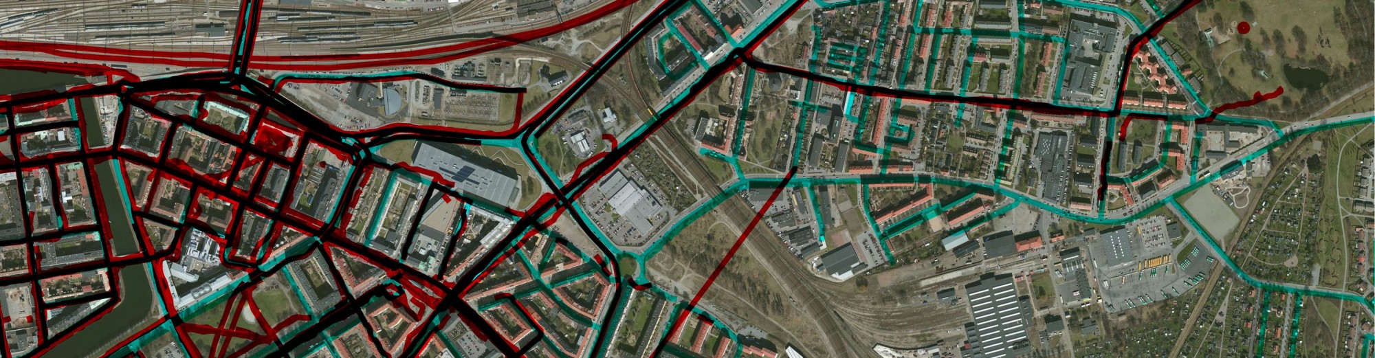
Nevertheless, I started working on this kind of research and made some early visualizations. Below are two videos showing how OpenStreetMap users pull images from Mapillary and edit the map based on other people’s contributions. How crazy is that? You grab one source of user generated content to improve another? Who would have thought about that 5 years ago?
The first map shows to what extent an OSM mapper loaded Mapillary photos to his editor (cyan rectangles) and showcases (with labels) whenever an editing activity based on those photos could have been identified. It means that people really check photos over an extensive area just to see if they can find some new details to add to the map. I think it’s impressive.
How long does it take to map an area with Mapillary? Well, apparently it’s up to you. According to he video below, it shouldn’t take long. It shows how street level photo coverage evolved in Phoenix, AZ between June 2015 and April 2016. I’m always amazed to see what can be achieved in just less than a year.
I’ve recently found Mapillary which is a great project that aims to cover the world with street level photos, just like Google’s StreetView. The big difference is that they use the crowdsourcing approach and collect images from volunteers, mostly equipped with smartphones or action cameras. All photos are available under CC BY-SA 4.0. They process all uploaded photos using computer vision on their servers. They have a nice API so everything is given. They’re open, they’re geospatial and they’re nice. You can talk with them via Twitter or email. They’ll respond. Currently, you can find them in Malmö, Sweden and in West Hollywood, Los Angeles. The project pretty soon has gone worldwide. The service was initially released in the last week of February 2014 at the Launch Festival and since then they cover 101658370 meters with 3541820 uploaded photos until September 21. Check out their site and see what they are doing. From my sight, it’s pretty impressive. I’ve shot this panorama view in Key West, FL.