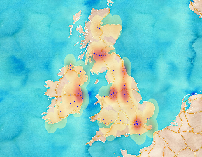
Originally I wanted to write about visualization in the 2nd post (and after that in the 3rd) but that post would have been too long to read. I always loose myself if it comes to writing but nevermind, finally it’s here. So, we know how to access to the DB and we can query for interesting subsets – even in a geographic way. All we have to do is to interpret our results. I’m presenting two ways, a gif animation and a wordcloud. It’s not about reinventing the wheel but still, I believe that these are useful approaches to complement each other.
Twitter data analysis from MongoDB – part 4, Visualizing Tweets
Leave a reply

