Originally I wanted to write about visualization in the 2nd post (and after that in the 3rd) but that post would have been too long to read. I always loose myself if it comes to writing but nevermind, finally it’s here. So, we know how to access to the DB and we can query for interesting subsets – even in a geographic way. All we have to do is to interpret our results. I’m presenting two ways, a gif animation and a wordcloud. It’s not about reinventing the wheel but still, I believe that these are useful approaches to complement each other.
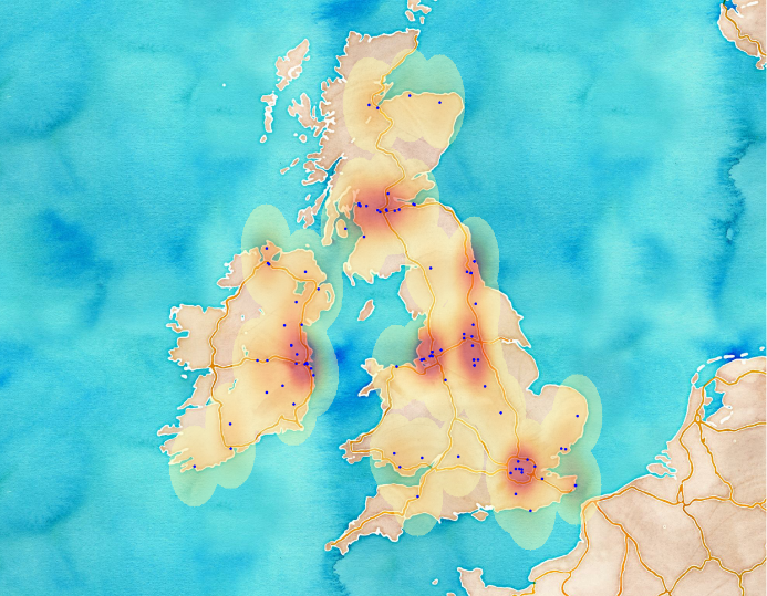
If you take a look at the temporal distribution of our data you can see that it ranges from 9.45am to 1.17pm. Unfortunately this fact again limits our possibilities to create a nice animation that really kicks ass but we’ll try our best. What we’re about to do is building 3 frames (we will just ignore tweets from 9am to 10am and 1pm to 2pm), each containing the location of harvested tweets in the given hour. After that we will combine these static maps in order to interpret results in a whole. An animation that contains more frames is better, though but we have to deal with the following categories:
- 10 – 11 h
- 11 – 12 h
- 12 – 13 h
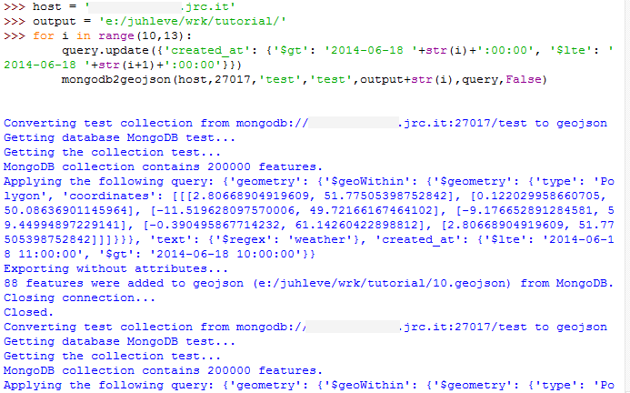
We will use QGIS, so the first task is to export each set of tweets to a separate GeoJSON file. So, let’s run mongodb2geojson() again, just like in the previous post. In the query expression, besides from $geoWithin and $regex operators, we will use the simple $gt and $lte operators (stand for greater than and lower than or equal).
Since an animation (and a video) contains frames that are combined after each other we’ll build the same. Now, we have 3 separate GeoJSON files that are ready to be visualized in QGIS. I have created some heatmaps and modified some properties of the visualization and a exported each frame to an image. Feel free to play with it. The fast way is to use “Save as Image” option, but one can use the Map Composer of QGIS as well. Doing so will enable a lot of tools to create nice maps. After exporting all frames, I usually use http://gifmaker.me/ where I can upload images and the site will convert it to a gif image. Another fast and elegant method is to use imagemagick to combine these images. I’ll write about it in another post. Let’s see our silly result. With a little bit of imagination you can believe it’ can be nice, I guess.
Weather related tweets in the UK from 10am to 1pm
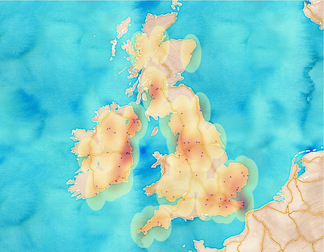
Having more data and using the Map Composer of QGIS can result something like this.
Also, you can take a look at a great plugin called Time Manager which can generate all the frames for you if you have timestamps as attributes.
Visualizing text content
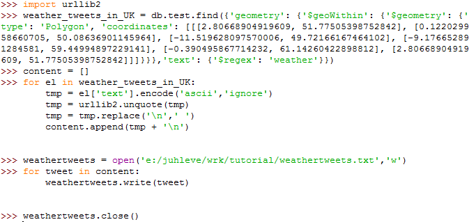
In order to analyze the content of the tweets, we have to print the content out. Character encoding and the percentage encoding can be annoying. For keeping it simple, we will decode everything to ascii. It can be a good solution since we work with English tweets, but we will miss some special characters, like smileys and others. By the end of this part, we will create a wordcloud using R (make sure you you read the introduction and have the necessary packages installed). As we have seen in the beginning of this tutorial, printing out is easy. Reading all the content is the best solution for sensing what is going on people’s mind related to each keyword. This part is hard to automatize since emotions are hard to understand by programming techniques. In my opinion, this is the biggest part of a Twitter analysis, and this is what relies on the analyzer most.
We will export all of our Tweet contents to text and import it to R in order to create a wordcloud, which can express an overall opinion of people’s tweets. Here’s the code.
In R:
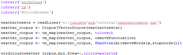
The code above will generate the following wordcloud.
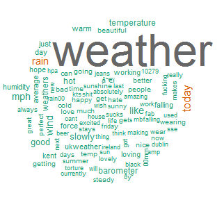
Corpus in the ‘tm’ package of R is basically a collection of text documents. We can call several built-in function to remove punctuations and some stopwords (you’re, that, I’m, etc.) which is necessary to clean up our data. After cleaning and modifying the Corpus, wordcloud package can generate some nice images. This is just a basic output so it can be easily improved. As seen on the figure, most frequent words in tweets were weather (which is not a surprise as we selected the tweets contained the word ‘weather’), today and rain. Although I haven’t checked the weather for that day, it is possible that it was raining from 10am to 1pm.
In the next (last?) post, I’ll present some results of my initial speed comparison between MongoDB and PostgreSQL.

