Oops, I forgot to share my “new” videos I made this June. Better later then never, I guess. Anyways, it’s part of my research that aims to understand how regular people on the Internet use different mapping platforms. Well, not just mapping platforms but basically any platforms that you can think of including Instagram, Foursquare, Twitter, Facebook an many more. We know that many of you use multiple services during your daily routines. Previous research focused on each of these data sources separately so we have a lot of knowledge on them (not playing the Big Brother here, I’m talking about an aggregated level). However, we do not yet know how the same individual uses these services simultaneously. Do activity spaces overlap? Is there a single main service or do people use different services with the same intensity? Does the introduction of a new service affect previous usage patterns? Can the user base from a platform drained by another? How do these processes work in time and space? Well, and I have many more questions. Probably way more questions than I can realistically answer, especially when don’t just talk about simple social media photos but really high quality mapping activities (as in editing OpenStreetMap and taking Mapillary street level photos specifically for mapping).
Nevertheless, I started working on this kind of research and made some early visualizations. Below are two videos showing how OpenStreetMap users pull images from Mapillary and edit the map based on other people’s contributions. How crazy is that? You grab one source of user generated content to improve another? Who would have thought about that 5 years ago?
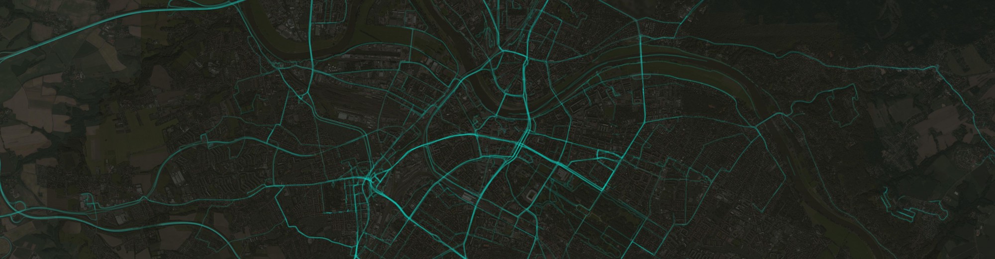
The first map shows to what extent an OSM mapper loaded Mapillary photos to his editor (cyan rectangles) and showcases (with labels) whenever an editing activity based on those photos could have been identified. It means that people really check photos over an extensive area just to see if they can find some new details to add to the map. I think it’s impressive.
Read on to check another video!
The other video shows the mapping activities of an individual (identified by user name) in these two different projects. OSM map edits are shown as yellow rectangles and Mapillary photo uploads as red lines. Pay attention to the intensity. You can barely find him mapping in two different platforms at the same time.
Well, I know what you’re thinking… I deliberately skipped the interpretation part as there’s still a long journey ahead of me until I understand every bit of this phenomenon. You just enjoy the maps and ping me with any questions you might have.

